Really Cool Glossy Progress/Result Bars in Pure CSS
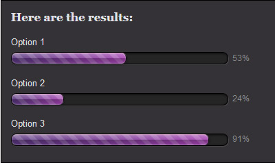
Inspired by this progress bar design, I decided to recreate the look using CSS. The end result is this:
The bars above were created purely with CSS (taking advantage of CSS3 properties such as linear-gradient and box-shadow), supported by all recent browsers versions except IE9 and below. Here is how, beginning with the HTML code.
<div id="container">
    <p id="title">Here are the results:</p>
    <p>Option 1</p>
    <!-- .barOuter is the box containing the bar,
         .barInner is the bar itself -->
    <div class="barOuter"><div class="barInner" style="width: 53%;"></div><div class="barLabel">53%</div></div>
    <p>Option 2</p>
    <div class="barOuter"><div class="barInner" style="width: 24%;"></div><div class="barLabel">24%</div></div>
    <p>Option 3</p>
    <div class="barOuter"><div class="barInner" style="width: 91%;"></div><div class="barLabel">91%</div></div>
</div>
First, to create the “track” (the outer box) that contains the purple bar, as well as the right-side label, the CSS code looks like this:
.barOuter {
    background: #252525;
    border: 1px solid #000;
    border-radius: 8px;
    box-shadow: inset 1px 1px 3px 0 rgba(0, 0, 0, 0.8), 1px 1px 0 0 rgba(255, 255, 255, 0.12);
    height: 16px;
    width: 85%;
    margin-bottom: 10px;
    position: relative;
}

.barLabel {
    color: #888;
    font-size: 12px;
    position: absolute;
    right: -32px;
    top: 0;
}
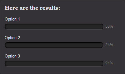
The goal is to make the track look like a 3D cut-out, and it is the inset and outer shadows that really sell the illusion. Here’s a look at where we’re at so far:
Next, give some style to the inner bars themselves. I’ll start with no linear gradient stuff:
.barInner {
    background-color: #A444B1;
    border-right: 1px solid #090909;
    border-radius: 7px;
    height: 100%;
    width: 50%;
}
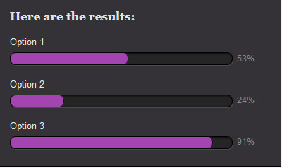
This nestles some flat purple bars in the tracks. Note they are given a default width of 50%, but it is expected their true width is to be specified in the HTML (as in this example) or with javascript.
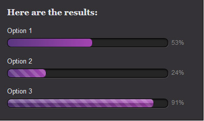
Now to make it pop, we’ll add three linear gradients to the bars. Remember that multiple CSS backgrounds stack top to bottom in the order you list them, so take care to have your most opaque backgrounds last. Our bottom background will be a solid left-to-right gradient from #5a377f (darker purple) to #a444b1 (lighter purple). On top of that will be a another gradient, this one creating a diagonal stripe effect that alternates between full transparency and a faint white that will lighten the underlying purple. On top of that will be one more gradient going from top to bottom to create the “shine” look.
The CSS that we’re adding to .barInner:
background-image:
  /* the shine layer */
  linear-gradient(to bottom,
                  rgba(255, 255, 255, 0.33) 0,
                  rgba(255, 255, 255, 0.08) 50%,
                  rgba(0, 0, 0, 0.25) 50%,
                  rgba(0, 0, 0, 0.1) 100%),
  /* the stripe layer */
  linear-gradient(45deg,
                  rgba(255, 255, 255, 0.16) 25%,
                  rgba(0, 0, 0, 0) 25%,
                  rgba(0, 0, 0, 0) 50%,
                  rgba(255, 255, 255, 0.16) 50%,
                  rgba(255, 255, 255, 0.16) 75%,
                  rgba(0, 0, 0, 0) 75%,
                  rgba(0, 0, 0, 0)),
  /* the purple gradient */
  linear-gradient(to right, #5A377F, #A444B1);

/* we also need background-size, because the stripe must repeat every 20 pixels */
background-size: 100% 100%, 20px 20px, 100% 100%;
Below is what the bars look like as each layer of background is added:
There is only one thing left to add, which is some box shadow on the bars to complete the look. Here I’ve used three shadows, the first two are top and bottom insets to give the bar more shine, while the third creates some shadow below and to the bar’s right.
box-shadow: inset 0 1px 1px 0px rgba(255, 215, 215, 0.5),
            inset 0 -1px 1px 0px rgba(255, 255, 255, 0.25),
            1px 1px 3px 0 rgba(0,0,0,0.33);
Put all together, this gives us the final look.
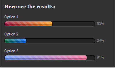
Then let’s say we want to lose the purple and try some other colors. It’s as easy as swapping out the bottom gradient for something else. Below are the gradients #903 to #f91, #063 to #06f, and #69f to #f69. Looks pretty cool!
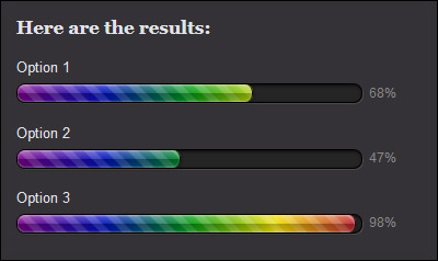
In fact you can make rainbow progress bars! And while we’re at it, you may want to make it so that the full spectrum is revealed only as the bar reaches full width. For that you need to define the width of the outer box in pixels rather than percent–let’s say 315px. Then change the background-size property on the inner bar to 100% 100%, 20px 20px, 315px 100%;. Here is the result:
Here is the full CSS for the purple bars all in one spot. Note that I haven’t included any browser prefixed properties (such as -webkit-linear-gradient), which you’ll probably want to do.
.barOuter {
    background: #252525;
    border: 1px solid #000;
    border-radius: 8px;
    box-shadow: inset 1px 1px 3px 0 rgba(0, 0, 0, 0.8), 1px 1px 0 0 rgba(255, 255, 255, 0.12);
    height: 16px;
    width: 85%;
    margin-bottom: 10px;
    position: relative;
}

.barLabel {
    color: #888;
    font-size: 12px;
    position: absolute;
    right: -32px;
    top: 0;
}

.barInner {
    background-color: #A444B1;
    border-right: 1px solid #090909;
    border-radius: 7px;
    height: 100%;
    width: 50%;
    background-size: 100% 100%, 20px 20px, 100% 100%;
    background-image:
        linear-gradient(to bottom,
                        rgba(255, 255, 255, 0.33) 0,
                        rgba(255, 255, 255, 0.08) 50%,
                        rgba(0, 0, 0, 0.25) 50%,
                        rgba(0, 0, 0, 0.1) 100%),
        linear-gradient(45deg,
                        rgba(255, 255, 255, 0.16) 25%,
                        rgba(0, 0, 0, 0) 25%,
                        rgba(0, 0, 0, 0) 50%,
                        rgba(255, 255, 255, 0.16) 50%,
                        rgba(255, 255, 255, 0.16) 75%,
                        rgba(0, 0, 0, 0) 75%,
                        rgba(0, 0, 0, 0)),
        linear-gradient(to right, #5A377F, #A444B1);
    box-shadow: inset 0 1px 1px 0px rgba(255, 215, 215, 0.5),
                inset 0 -1px 1px 0px rgba(255, 255, 255, 0.25),
                1px 1px 3px 0 rgba(0,0,0,0.33);
}

Nice example, but how do you centralize it on a page without it messing up the bar layout by centralizing that as well?
The last example, for me it is not working.
Ok got it to work, thx for example. The only question I have is, how do I remove the linear-gradient(45deg, so that the loader will still change color as is shoed.