Recreating a Logo in SVG (from a PNG)
This is the hdpi logo for GoToQuiz.com, in PNG format:
It’s file size is only 3.83KB, which isn’t bad at all. And it looks crisp on hdpi screens. But I wanted to try recreating it in SVG anyway, mainly as a learning exercise.
Getting the basic outline of the letters was easy, given how blocky they are. I had Adobe Illustrator trace them and output the result as an SVG. This would be my starting point for hand-coding the rest.
First, I rounded off each point that Illustrator generated to integers. For such simple shapes, integers really just make it easier to ensure everything is lining up. A few lines ended up a pixel off from where I wanted them, but that was easy to correct. So this was my starting point:
<svg version="1.1" xmlns="http://www.w3.org/2000/svg"
     xmlns:xlink="http://www.w3.org/1999/xlink"
     width="266" height="64" viewBox="0 0 266 64">

  <!-- G -->
  <polygon points="32,1 32,11 11,11 11,41 22,41 22,35 17,35 17,28 32,28 32,51 1,51 1,1"/>

  <!-- o -->
  <path id="o" d="M41,25h26v26H41L41,25z M51,32v13h6V32H51z"/>

  <!-- T -->
  <polygon points="66,1 102,1 102,11 89,11 89,51 79,51 79,11 66,11"/>

  <!-- o -->
  <use xlink:href="#o" transform="translate(60)"/>

  <!-- Q -->
  <path d="M136,1h30v46h7v10h-10v-6h-27L136,1z M146,10v31h10V10H146z"/>

  <!-- u -->
  <polygon points="190,25 190,45 196,45 196,25 206,25 206,51 180,51 180,25"/>

  <!-- i -->
  <rect x="215" y="13" width="10" height="7"/>
  <rect x="215" y="25" width="10" height="26"/>

  <!-- z -->
  <polygon points="234,25 260,25 260,31 247,45 260,45 260,51 234,51 234,46 250,32 234,32"/>

</svg>
The only quirk above is, you can see I’m reusing the first “o” for the second “o”, just shifting it over 60 pixels.
I’m going to be reusing this set of letters several times, so I moved it up into a defs section and placed them in a group. Next I created the blue outline by “use”-ing the group and applying a stroke. I also modified the viewBox attribute up in the svg tag to shift everything over by 0.5 pixels. Why? Because in SVG all strokes are centered on paths, so a 1 pixel stroke will be split across pixels. See the first line below in a hypothetical zoomed-in grid of pixels:
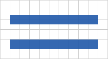
By shifting everything by half a pixel, the strokes fill whole pixels only, as seen in the second line. Here’s the updated code:
<svg version="1.1" xmlns="http://www.w3.org/2000/svg"
     xmlns:xlink="http://www.w3.org/1999/xlink"
     width="266" height="64" viewBox="0.5 0.5 266 64">
  <defs>

    <g id="logo">
      <!-- G -->
      <polygon points="32,1 32,11 11,11 11,41 22,41 22,35 17,35 17,28 32,28 32,51 1,51 1,1"/>

      <!-- o -->
      <path id="o" d="M41,25h26v26H41L41,25z M51,32v13h6V32H51z"/>

      <!-- T -->
      <polygon points="66,1 102,1 102,11 89,11 89,51 79,51 79,11 66,11"/>

      <!-- o -->
      <use xlink:href="#o" transform="translate(60)"/>

      <!-- Q -->
      <path d="M136,1h30v46h7v10h-10v-6h-27L136,1z M146,10v31h10V10H146z"/>

      <!-- u -->
      <polygon points="190,25 190,45 196,45 196,25 206,25 206,51 180,51 180,25"/>

      <!-- i -->
      <rect x="215" y="13" width="10" height="7"/>
      <rect x="215" y="25" width="10" height="26"/>

      <!-- z -->
      <polygon points="234,25 260,25 260,31 247,45 260,45 260,51 234,51 234,46 250,32 234,32"/>
    </g>

  </defs>

  <!-- outline -->
  <use xlink:href="#logo" style="stroke: #1f58a9; fill:none;"/>

</svg>
Result:
Next step, add a gradient fill. This is the definition for the gradient, added under the defs tag:
    <linearGradient id="grad" x1="0" y1="0" x2="0" y2="100%">
      <stop offset="50%" stop-color="#3d76c7"/>
      <stop offset="100%" stop-color="#52a1dc"/>
    </linearGradient>
Then reuse our letter group again, applying the gradient, by adding this line before our outline (it is added before so that it appears behind the outline):
<!-- gradient fill -->
<use xlink:href="#logo" style="fill: url(#grad);"/>
The original logo has a 1 pixel gray outline below and to the right of the letters. To recreate that, reuse our letter group again, appearing before (i.e. below) both the gradient fill and outline, like this:
<!-- gray letters -->
<use xlink:href="#logo" style="stroke: #bbb; fill:#bbb;"
     transform="translate(1,1)"/>
Now things begin to get a little tricky. The PNG logo has a light inset shadow as well as a regular drop shadow. Not being well-versed in SVG filters, I had to do some searching on these. Google offers up many examples for creating drop shadows, but the inset shadow was more difficult. Eventually I found this post with a flawless solution. Here’s the filter markup I ended up using:
    <filter id="inset" x0="-50%" y0="-50%" width="200%" height="200%">
      <feGaussianBlur in="SourceAlpha" stdDeviation="1.4"/>
      <feOffset dy="1" dx="1"/>
      <feComposite in2="SourceAlpha" operator="arithmetic" k2="-1" k3="1" result="s"/>
      <feFlood flood-color="#def" flood-opacity="0.6"/>
      <feComposite in2="s" operator="in"/>
      <feComposite in2="SourceGraphic" operator="over"/>
    </filter>
Values to adjust are the attributes in feGaussianBlur (the blurriness), feOffset (offset of the inset shadow), and feFlood (shadow color and opacity). Let’s apply this filter to the gradient fill object:
<!-- gradient fill, with inset shadow -->
<use xlink:href="#logo" style="fill: url(#grad); filter: url(#inset);"/>
Finally, the logo needs the drop shadow. Here’s the filter markup:
    <filter id="shadow">
      <feGaussianBlur in="SourceAlpha" stdDeviation="1.3"/>
      <feOffset dx="3" dy="3"/>
      <feComponentTransfer>
        <feFuncA type="linear" slope="0.22"/>
      </feComponentTransfer>
      <feMerge>
        <feMergeNode/>
        <feMergeNode in="SourceGraphic"/>
      </feMerge>
    </filter>
Again, the blur and offset can be adjusted, and here the slope attribute of feFuncA controls the opacity. I want this filter applied also to the gradient fill object, but it already has a filter. How to apply two filters to the same object? It doesn’t seem possible in SVG, but there is a work-around. Wrap the object in a group tag and apply the second filter to the group. Like this:
  <!-- drop shadow -->
  <g filter="url(#shadow)">
    <!-- gradient fill, with inset shadow -->
    <use xlink:href="#logo" style="fill: url(#grad); filter: url(#inset);"/>
  </g>
Here is the full SVG markup:
<svg version="1.1" xmlns="http://www.w3.org/2000/svg"
     xmlns:xlink="http://www.w3.org/1999/xlink"
     width="266" height="64" viewBox="0.5 0.5 266 64">
  <defs>

    <linearGradient id="grad" x1="0" y1="0" x2="0" y2="100%">
      <stop offset="50%" stop-color="#3d76c7"/>
      <stop offset="100%" stop-color="#52a1dc"/>
    </linearGradient>

    <filter id="inset" x0="-50%" y0="-50%" width="200%" height="200%">
      <feGaussianBlur in="SourceAlpha" stdDeviation="1.4"/>
      <feOffset dy="1" dx="1"/>
      <feComposite in2="SourceAlpha" operator="arithmetic" k2="-1" k3="1" result="s"/>
      <feFlood flood-color="#def" flood-opacity="0.6"/>
      <feComposite in2="s" operator="in"/>
      <feComposite in2="SourceGraphic" operator="over"/>
    </filter>

    <filter id="shadow">
      <feGaussianBlur in="SourceAlpha" stdDeviation="1.3"/>
      <feOffset dx="3" dy="3"/>
      <feComponentTransfer>
        <feFuncA type="linear" slope="0.22"/>
      </feComponentTransfer>
      <feMerge>
        <feMergeNode/>
        <feMergeNode in="SourceGraphic"/>
      </feMerge>
    </filter>

    <g id="logo">
      <!-- G -->
      <polygon points="32,1 32,11 11,11 11,41 22,41 22,35 17,35 17,28 32,28 32,51 1,51 1,1"/>

      <!-- o -->
      <path id="o" d="M41,25h26v26H41L41,25z M51,32v13h6V32H51z"/>

      <!-- T -->
      <polygon points="66,1 102,1 102,11 89,11 89,51 79,51 79,11 66,11"/>

      <!-- o -->
      <use xlink:href="#o" transform="translate(60)"/>

      <!-- Q -->
      <path d="M136,1h30v46h7v10h-10v-6h-27L136,1z M146,10v31h10V10H146z"/>

      <!-- u -->
      <polygon points="190,25 190,45 196,45 196,25 206,25 206,51 180,51 180,25"/>

      <!-- i -->
      <rect x="215" y="13" width="10" height="7"/>
      <rect x="215" y="25" width="10" height="26"/>

      <!-- z -->
      <polygon points="234,25 260,25 260,31 247,45 260,45 260,51 234,51 234,46 250,32 234,32"/>
    </g>

  </defs>

  <!-- gray letters -->
  <use xlink:href="#logo" style="stroke: #bbb; fill:#bbb;"
       transform="translate(1,1)"/>

  <!-- drop shadow -->
  <g filter="url(#shadow)">
    <!-- gradient fill, with inset shadow -->
    <use xlink:href="#logo" style="fill: url(#grad); filter: url(#inset);"/>
  </g>

  <!-- outline -->
  <use xlink:href="#logo" style="stroke: #1f58a9; fill: none;"/>

</svg>
And that’s it, an SVG version of the PNG logo, complete with outline, gradient, and inset and offset shadows. For comparison, the SVG on top and PNG below:
Oh, and the file size of the SVG after “compressing” (removing comments and whitespace) is a mere 1.72KB, less than half that of the PNG. GZipping takes it down to 0.8KB. Very nice indeed!